- That they understood the narrative clearly
- That they thought that the lighting was good
- They feel that during the middle where there was a few random shots of the artist just standing there, I should have integrated more the storyline or something else that fits the pop genre, like cheoreography
Showing posts with label Cherise Morrison-Greaves. Show all posts
Showing posts with label Cherise Morrison-Greaves. Show all posts
Friday, 3 February 2017
Audience Feedback on Final Music Video
For the feedback what most people said was:

Wednesday, 1 February 2017
Blogging Health Check 3

- I have moved the 'Pictures I am using' blog before the completed print work
- I have also added the audience feedback I received on the final music video cut
- I have added what my ancillary products looked like before they were completed
- I have also used PhotoSnack to create a slide show for my 'Pics' post (http://www.photosnack.com/cherisemorrison/potentialimages.html)
Tuesday, 24 January 2017


Monday, 23 January 2017
Friday, 20 January 2017


Inside Panels of digipak so far

Need to add who produced my songs to make my tracklist more detailed, than just having the the song length
Need to make the CD space even larger because the CD takes up majority of the right side of the panel
Why I used this font
I used the Abadi MT Condensed Extra Bold font for my ancillary products because I wanted to created synergy between my music video and my ancillary products. The artist name is written in the same font style and colour throughout all my products. This font is also used for the tour date locations and the tracklist numbers.


 I used Lucida Handwriting Italic to create a visual link between my music video and ancillary products. This font is used for the ablum name in all the products. It is also used for other smaller text such as 'debut album', tracklist, reviews and tour date days.


Pictures I'm using and why


This is another inside panel image. I am using this image because I want to use a variety of camera shots because my other images are mid shots. The close up of the eyes also show their makeup which creates an opportunity for synergy.

This is an image on the advertisement. I used this image to creates synergy with the yellow jacket and hair style. Same eye makeup is used.
Editing on Photoshop for my advertisement
I used Photoshop to edit images and to add in text in my ancillary products. I used the quick selection tool to select what part of the image I want to keep. After doing that I used the 'Select and Mask' feature, alongside the 'Refine Edge Brush Tool', to erase the white edges around the artist. After doing that I used to 'Smooth' and 'Feather' tool to make the image blend in better and make the edges not as rough.
Advertisement so far

Need to add a lot more information to it such as website link for artist
Need to add something else such as tour dates or ratings because right now it is very plain
It is good that the front panel of digipak is on the advertisement and the artist name is clearly visible
Wednesday, 18 January 2017
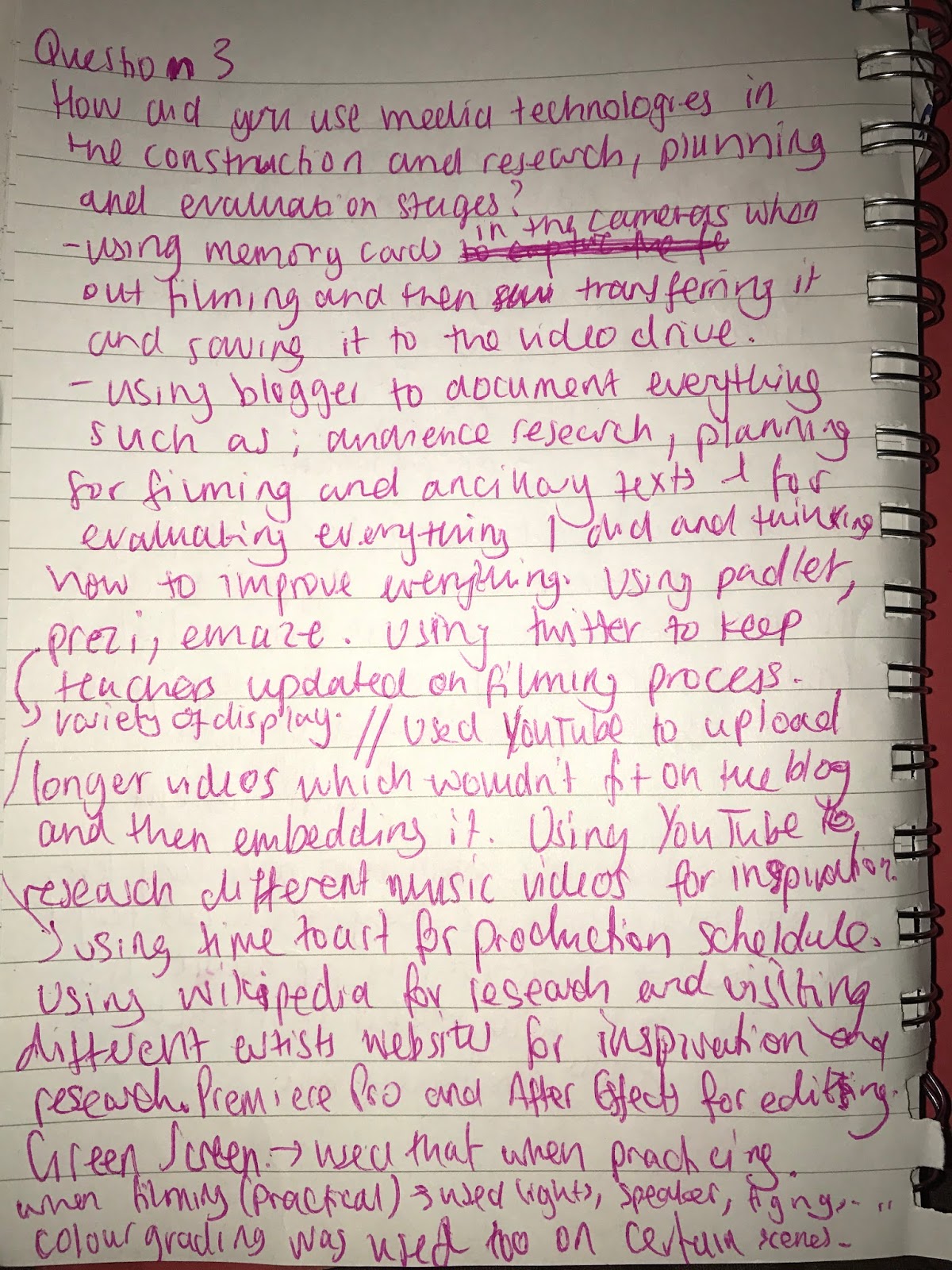
Notes and ideas on evaluation questions 3 & 4 (Blog task 46)

Subscribe to:
Posts (Atom)