- That they understood the narrative clearly
- That they thought that the lighting was good
- They feel that during the middle where there was a few random shots of the artist just standing there, I should have integrated more the storyline or something else that fits the pop genre, like cheoreography
Friday, 3 February 2017
Audience Feedback on Final Music Video
For the feedback what most people said was:
Thursday, 2 February 2017
How i used photoshop
This is a camtasia of how i used photo shop. This clip shows how i had placed the main image onto the template, and then cut it out to how i wanted it.
Wednesday, 1 February 2017
Blogging Health Check 3
Since this blogging health check:
- I have moved the 'Pictures I am using' blog before the completed print work
- I have also added the audience feedback I received on the final music video cut
- I have added what my ancillary products looked like before they were completed
- I have also used PhotoSnack to create a slide show for my 'Pics' post (http://www.photosnack.com/cherisemorrison/potentialimages.html)
Tuesday, 31 January 2017
Website Progression
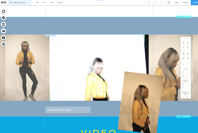
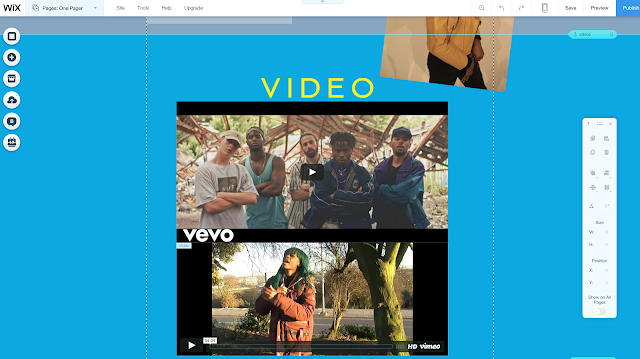
This is the progress I made on my website so far. I put an image of the artists in the same outfit she wore in the music video. That will be the first image that the audience will see.
I have also kept the same colour scheme throughout so theres some synergy though the ancillary work. In the Photos I put all the images from the photoshoot, however Kiki has different coloured hair but its still the same style.
BHC3 Feedback
This is the feedback i received from my blogging health check 3. To improve this feedback,i will complete a blog post on how i used photoshop,by doing a camtasia just to show the basics such as how i crop photos,blend photos,and add certain elements using photoshop. I will also add more feedback posts on my mock-ups and flatplans, to show how i took feedback into consideration during the production of my ancillary products. I will also re arrange the order of my posts in order to have my evaluation questions last on the blog.
Friday, 27 January 2017
Tuesday, 24 January 2017
Monday, 23 January 2017
A Few Changes to the Digipak
For Kiki Karmels Digipak I have decided to change the theme to the cover, for the reasons being is because I don't believe the images and the designs link with the theme I planned to go for and it wasn't the look I was going for. The colours seem to clash and the pictures may not be clearer and there are a lot of things I would need to add on and fix all over. For example the Colour theme and I also need to add one more picture at the back of the digipak as that was my original idea. On the inside I have decided I'm going to keep it a bit more clearer but link with the theme very will with the colour theme, however I will be keeping the pattern designs I created in my draft digipak. 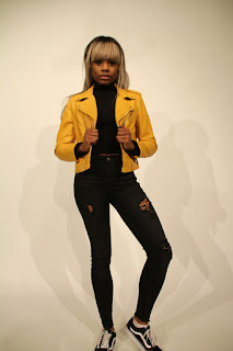


This is the picture I have decided to use for
the back of my digipak because it is a full
body picture of Kiki
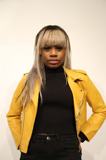
The second picture,This is what I wanted to use for the front
of my digipak because its a close up of Kiki and its a lot clearer
Sunday, 22 January 2017
Saturday, 21 January 2017
What Pictures I Will be Using For Kiki's Digipak
These are the pictures I have decided to use instead of the ones I have on my digipak at the moment, this is because these pictures are a lot clearer than the others also having the white background helps the artist stand out with the yellow jacket and also the bright hair, which also contrats the black clothing. These pictures are also going to help me pick the theme for Kikis Digipak because I feel the colour theme I have at the moment is a little bit too much.
Friday, 20 January 2017
Final website link
Here is the link to my final website along with some screen shots of the homepage and about page.
https://ab64512.wixsite.com/kikikarmel
https://ab64512.wixsite.com/kikikarmel
Inside Panels of digipak so far
Need to add who produced my songs to make my tracklist more detailed, than just having the the song length
Need to make the CD space even larger because the CD takes up majority of the right side of the panel
Why I used this font
I used the Abadi MT Condensed Extra Bold font for my ancillary products because I wanted to created synergy between my music video and my ancillary products. The artist name is written in the same font style and colour throughout all my products. This font is also used for the tour date locations and the tracklist numbers.
I used Lucida Handwriting Italic to create a visual link between my music video and ancillary products. This font is used for the ablum name in all the products. It is also used for other smaller text such as 'debut album', tracklist, reviews and tour date days.
I used Lucida Handwriting Italic to create a visual link between my music video and ancillary products. This font is used for the ablum name in all the products. It is also used for other smaller text such as 'debut album', tracklist, reviews and tour date days.
Pictures I'm using and why
This is the front cover picture and the reason I'm using it is because I like that it has a low camera angle. It makes the artist seems in dominance and in power.
This is the inside panel image. I'm using this image to create a smooth connection between the front cover and the inside.
This is the inside panel image. I'm using this image to create a smooth connection between the front cover and the inside.
This is another inside panel image. I am using this image because I want to use a variety of camera shots because my other images are mid shots. The close up of the eyes also show their makeup which creates an opportunity for synergy.
This is an image on the advertisement. I used this image to creates synergy with the yellow jacket and hair style. Same eye makeup is used.
Editing on Photoshop for my advertisement
I used Photoshop to edit images and to add in text in my ancillary products. I used the quick selection tool to select what part of the image I want to keep. After doing that I used the 'Select and Mask' feature, alongside the 'Refine Edge Brush Tool', to erase the white edges around the artist. After doing that I used to 'Smooth' and 'Feather' tool to make the image blend in better and make the edges not as rough.
Advertisement so far
Need to add a lot more information to it such as website link for artist
Need to add something else such as tour dates or ratings because right now it is very plain
It is good that the front panel of digipak is on the advertisement and the artist name is clearly visible
Wednesday, 18 January 2017
Notes and ideas on evaluation questions 3 & 4 (Blog task 46)
Audience feedback is important because it helped our final products become better. The audience feedback helped create a motif of text used in our final music video, which in turn, helped create synergy between the ancillary texts.
Tuesday, 17 January 2017
Subscribe to:
Comments (Atom)


